
The four variants
All four render the same four images. Pick by what the reader needs to do.
1. filmstrip — scan the whole sequence
Every frame visible at a glance, scroll horizontally for the rest. Best when the reader wants the gist without committing to a click. No JavaScript required.
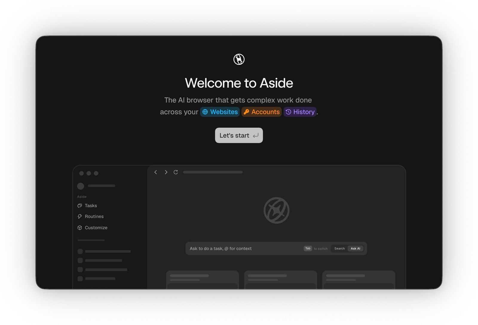
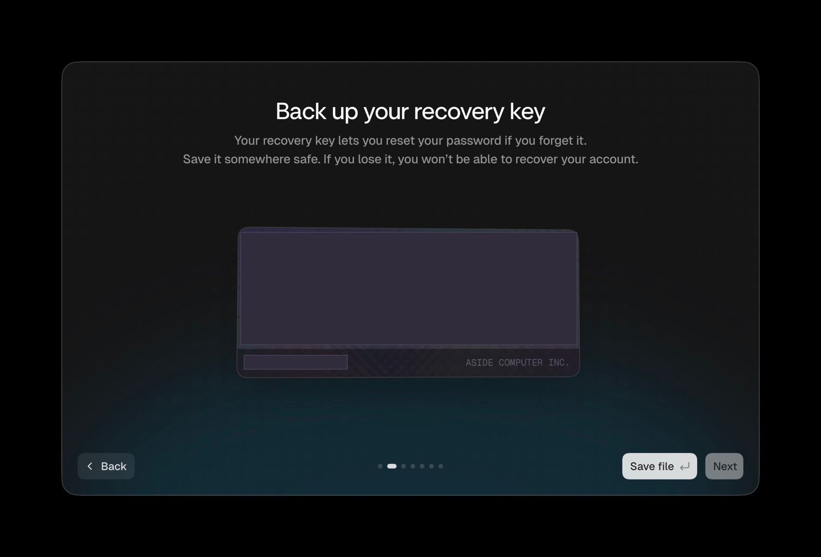
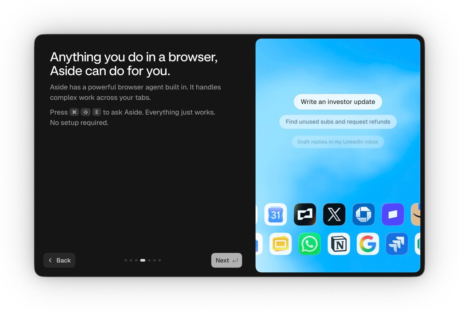
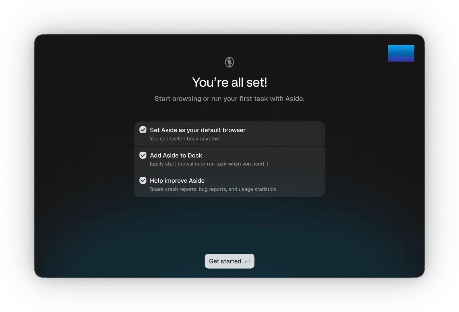
2. stepper — walk it one screen at a time
One full-width frame, numbered dots, prev/next, and a live "Step N of M" readout. Best for an actual procedure the reader might follow along with. This is the one built for a setup flow.
3. peek — editorial focus
A dominant focal frame with its neighbours bleeding in at reduced opacity, so the sequence reads as a sequence without losing the hero image. Best inside prose where the carousel is an illustration rather than an instruction.
4. contact-sheet — no scrolling at all
A responsive grid; every frame on screen at once, numbered. Not really a carousel — but for a four-step flow it's often the most honest option, because nothing is hidden behind an interaction.
Syntax
:::image-carousel{variant="stepper" title="Setting up Aside"}
::image{src="/1.jpg" alt="…" label="Welcome" caption="…"}
::image{src="/2.jpg" alt="…" label="Recovery key" caption="…"}
:::
:::img-carousel is a syntactic alias — identical render, per the LFM polyglot rule.
Attributes
| Attribute | Values | Default | Notes |
variant | filmstrip · stepper · peek · contact-sheet | filmstrip | Unknown values fall back to the default rather than failing |
title | string | — | Renders above the track; also becomes the group's accessible name |
numbered | true · false | true | Ordinal badge on each frame |
max-height | CSS length | per-variant | Caps media height |
Per-slide, the nested ::image accepts src, alt, label (short step name) and
caption.
Alias check
The block below uses :::img-carousel rather than :::image-carousel. It must render
identically to variant 1 above.
Degradation
Every variant is CSS-first: scroll-snap and anchor-link dots do the work, so the
component stays usable with JavaScript disabled. The script only adds the live step
readout, active-dot state, and arrow-key support. prefers-reduced-motion disables
smooth scrolling and the peek transition.