Working Groups · Peer Learning
Projects shipped together.
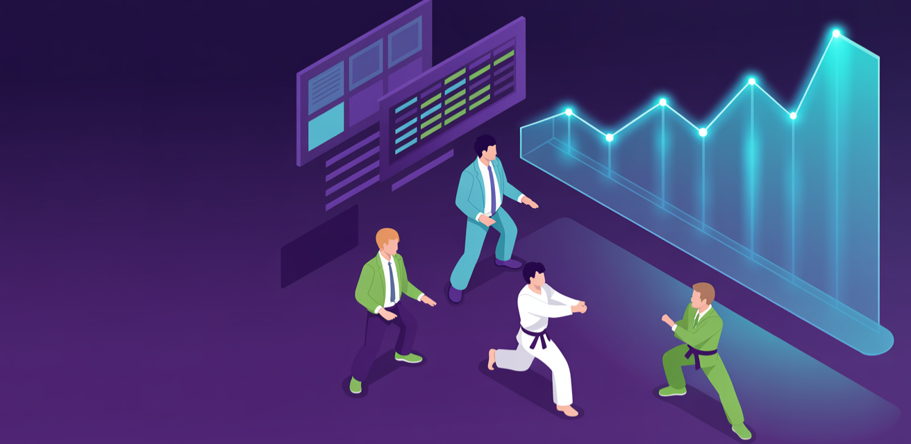
Active working groups in the FullStack VC community.
We don't ship for the sake of shipping. We ship to learn — and the projects below are how the community puts that into practice.
 FullStack VC
 Design System · Heroes
Wraps HeroContentCoreMessage with a full-bleed image banner.
Toggle modes to verify legibility in light / dark / vibrant.
height: standard · overlay: gradient · align: left (default for /projects/)
height: short · overlay: scrim · align: center
height: tall · overlay: none · align: left · without CTA
<HeroBanner
  image="/og/projects.png"
  imageAlt=""
  overlay="gradient"          /* 'gradient' | 'scrim' | 'none' */
  align="left"                /* 'left' | 'center' */
  height="standard"           /* 'short' | 'standard' | 'tall' */

  contextSetterTxt="..."      /* renders into eyebrow */
  headerTxt="..."             /* renders into headline (h1) */
  subheaderTxt="..."          /* renders into subheader (h2) */
  supportingTxt="..."         /* renders into supporting paragraph */
  ctaLabelTxt="..."           /* renders into CTA button label */
  ctaHref="..."
/>

/* Tokens read */
--color-background, --color-surface, --color-text, --color-text-muted,
--color-primary, --fx-headline-gradient, --fx-card-shadow, --fx-card-shadow-hover,
--font-display, --font-body, --font-code