People as first-class subjects — one PersonCard, one resolver, one truth
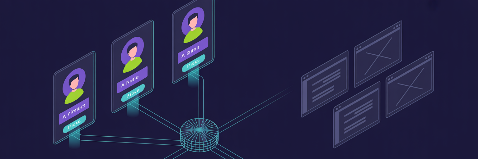
Three places used to introduce a human — webinar presenters, project leads, working-group leads — with three different markup paths and three different fallbacks. Consolidated into a single PersonCard--Bare component plus a participants resolver that auto-fills avatar, firm, and profile link from the participants collection by case-insensitive name match. Frontmatter stays slim; one source of truth for what a person looks like across the site. Plus a small UX kit (ToolTipIndicator, CtaBtnWithAuthIcons, About-as-popdown-topline, dojo CTA explainer) introduced en route.
Changelog — 2026-04-29 (02)
People as first-class subjects
This entry consolidates 6f0909c (PersonCard extraction + resolver) and 19572da (the small UX kit that landed alongside).
Why Care?
Every place the site introduces a human deserves the same treatment: avatar, name, firm, role, and a link to that person’s profile. Until today, each surface — Section__WebinarPresenters, ProjectMetadataDisplay, WorkingGroupMetadataDisplay — re-implemented all of that inline, with subtly different fallbacks. A presenter’s GitHub avatar showed up on the session page but the same person’s project-lead row two clicks away rendered as initials in a circle, because that surface didn’t know to look. The resolver fixes that, and the shared component makes it visible.
What Got Built
PersonCard--Bare.astro
The canonical “person row.” Avatar with --color-primary halo (or initials fallback, or a dashed-border ? placeholder for TBD), name in display font (linked when profile is set), firm in code-font primary, muted role underneath. Optional topic block on the right with a vertical dashed divider — used by webinar presenters (“Presenting on …”), absent in metadata-strip contexts.
<PersonCardBare
  name="Michael Staton"
  firm="Lossless Group / FullStack VC"
  role="Lead"
  avatar="https://avatars.githubusercontent.com/u/4084538"
  profile="https://www.linkedin.com/in/michaelstaton/"
/>
Three consumers refactored to use it: Section__WebinarPresenters (lifted ~170 lines of duplicated styling), ProjectMetadataDisplay, WorkingGroupMetadataDisplay. The tbd variant renders for proposed groups still recruiting a lead — dashed border, lower opacity, “Lead opening · introduce yourself in the working group” hint line. Replaces the previous “Lead: TBD” plain text that read as a placeholder bug.
lib/resolve-people.ts — the resolver
Free-form person blocks in markdown frontmatter (working_group_leads, working_group_members, presenterDetails) are enriched against the participants content collection by case-insensitive name match.
const index = await buildIndex();        // built once: name.toLowerCase() → participant entry
const match = index.get(input.name.trim().toLowerCase());
if (!match) return { ...input, isTbd: false };
const d = match.data;
return {
  name: input.name,
  firm:    input.firm    ?? d.firm,
  role:    input.role,                                  // role keeps its project-level label
  profile: input.profile ?? d.linkedin ?? d.github,
  avatar:  input.avatar  ?? d.headshot ?? d.github_avatar,
  isTbd: false,
  handle: d.handle,
};
Inline frontmatter values always win — the resolver only fills gaps. “TBD” / “TBA” / blank pass through with isTbd: true so renderers can show the placeholder variant.
Net effect: every project and working-group file that says name: "Michael Staton" now picks up the GitHub headshot + Lossless Group / FullStack VC firm + LinkedIn link from src/content/participants/mpstaton.md automatically. Zero frontmatter migration. When a future Fellow’s participant entry lands, every project they lead lights up with their face the next build.
The resolver is deliberately simple — string match, no fuzzy logic. Brittle to renames (typo a name and the avatar silently goes blank) but trivial to debug and zero migration cost today. The escape hatch when it gets annoying is adding a participant: <handle> field to the leads/members schema as a canonical reference, with name match as fallback.
The UX Kit That Came Along
While reorganizing surfaces around people, three small components landed that the dojo CTA needed:
CtaBtnWithAuthIcons.astro
CTA button that signals which auth providers the destination accepts. LinkedIn + GitHub glyphs on the leading edge with a thin divider, then the label, then a → that slides on hover. Same chrome as HeroContentCoreMessage’s default CTA so it slots into the hero’s cta named slot. Used on /dojo for the “Join by creating an account” entry point — communicates “you’ll sign in with one of these” before the click rather than after.
ToolTipIndicator.astro
Subtle ”?” circle that reveals an explanatory bubble on hover or focus. Touch users tap to focus; tap elsewhere blurs. Zero JS — :hover + :focus-within drive visibility. Pass copy via the default slot (HTML allowed) or the text prop.
Why an account?
<ToolTipIndicator label="Why an account is required">
  Sessions have live polls and saved-state features (your tool stack, the
  dispatches feed). Sign-in keeps the room to verified venture folks — no
  spam, no bots.
</ToolTipIndicator>
The dojo page now answers the two predictable doubts (“WTF do I need to create an account for?” / “What do you do with my info?”) inline with the CTA, instead of forcing the reader to an FAQ they won’t find.
About moved into the More popdown
The “About” link used to live in a thin utility strip above the main header — visually separated, easy to miss, never scrolling-aware. It now appears as a quiet inline “topline” row inside JumboPopdown__More, above the People + Stacks tiles. Code-font caps in --color-primary, descriptor in muted text, → on hover. One-third the height of the grid items, reads as “by the way” rather than “look here.” Header itself loses its utility strip.
Decisions
- Resolver does name match, not handle reference. Adding a
participant:handle field to the schema would have been more durable but required touching every existing project/WG file. Name match buys “works today” with zero migration; we’ll graduate to the handle field if false negatives start showing up in the wild. - Three named consumer wrappers, one shared component. Could have collapsed
Section__WebinarPresentersinto a thin shell over PersonCard—Bare too, but the section carries its own header (eyebrow + heading + hosts line) and isn’t really a peer of “render one person card.” Kept the section, it just delegates row rendering. - Topic prop on PersonCard, not a sibling component. Webinar presenters need an extra “Presenting on” block. Could have been a separate
PresenterCard.astroextending PersonCard. Kept it as an optional prop —:has(.pcard-bare__topic)swaps the grid to two-up when present, else stays single-column. One component, one mental model.
Verification
/sessions/2026-04-29_agentic-vc-dojo-launch— presenter cards render with headshots and topics./projects/content-farm,/projects/memopop-ai,/projects/augment-it,/projects/astro-knots,/projects/lossless-flavored-markdown— all leads show the GitHub headshot + firm + LinkedIn link without any of those files referencing those values directly./working-groups/data-driven-venture,/working-groups/tech-stack-deep-dives— leads show the dashed TBD card with the “Lead opening” hint instead of a hardcoded “TBD” string./design-systemcatalog updated withPersonCard--Bare,CtaBtnWithAuthIcons,ToolTipIndicatorentries.- About link now lives in the More popdown’s topline row; header’s utility strip is gone; mobile drawer keeps its inline
/aboutlink unchanged.
Files modified (11)
sites/fullstack-vc/src/components/people/PersonCard--Bare.astrosites/fullstack-vc/src/lib/resolve-people.tssites/fullstack-vc/src/components/sections/ProjectMetadataDisplay.astrosites/fullstack-vc/src/components/sections/WorkingGroupMetadataDisplay.astrosites/fullstack-vc/src/components/sections/Section__WebinarPresenters.astrosites/fullstack-vc/src/components/buttons/CtaBtnWithAuthIcons.astrosites/fullstack-vc/src/components/ui/ToolTipIndicator.astrosites/fullstack-vc/src/components/ui/menus/JumboPopdown__More.astrosites/fullstack-vc/src/components/basics/Header.astrosites/fullstack-vc/src/pages/dojo/index.astrosites/fullstack-vc/src/pages/design-system/index.astro